In my last post I talked about how a redesigned my site, but didn’t provide any photos as a comparison. So I wanted to do that quickly here.
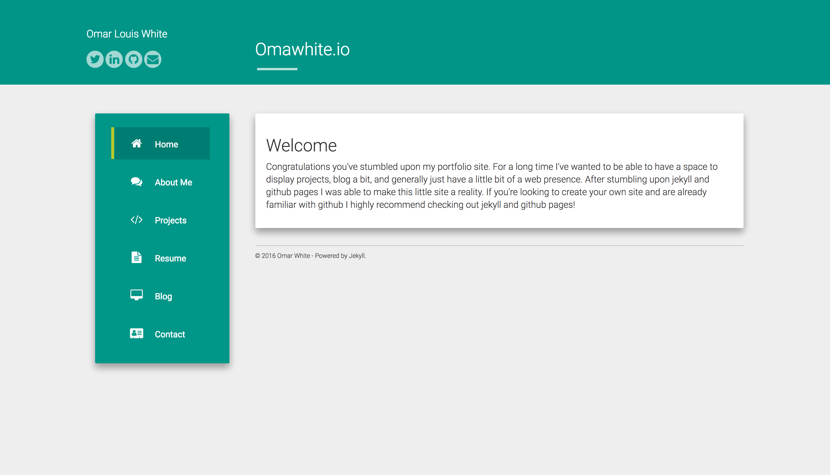 Here we have the home page of the old site.
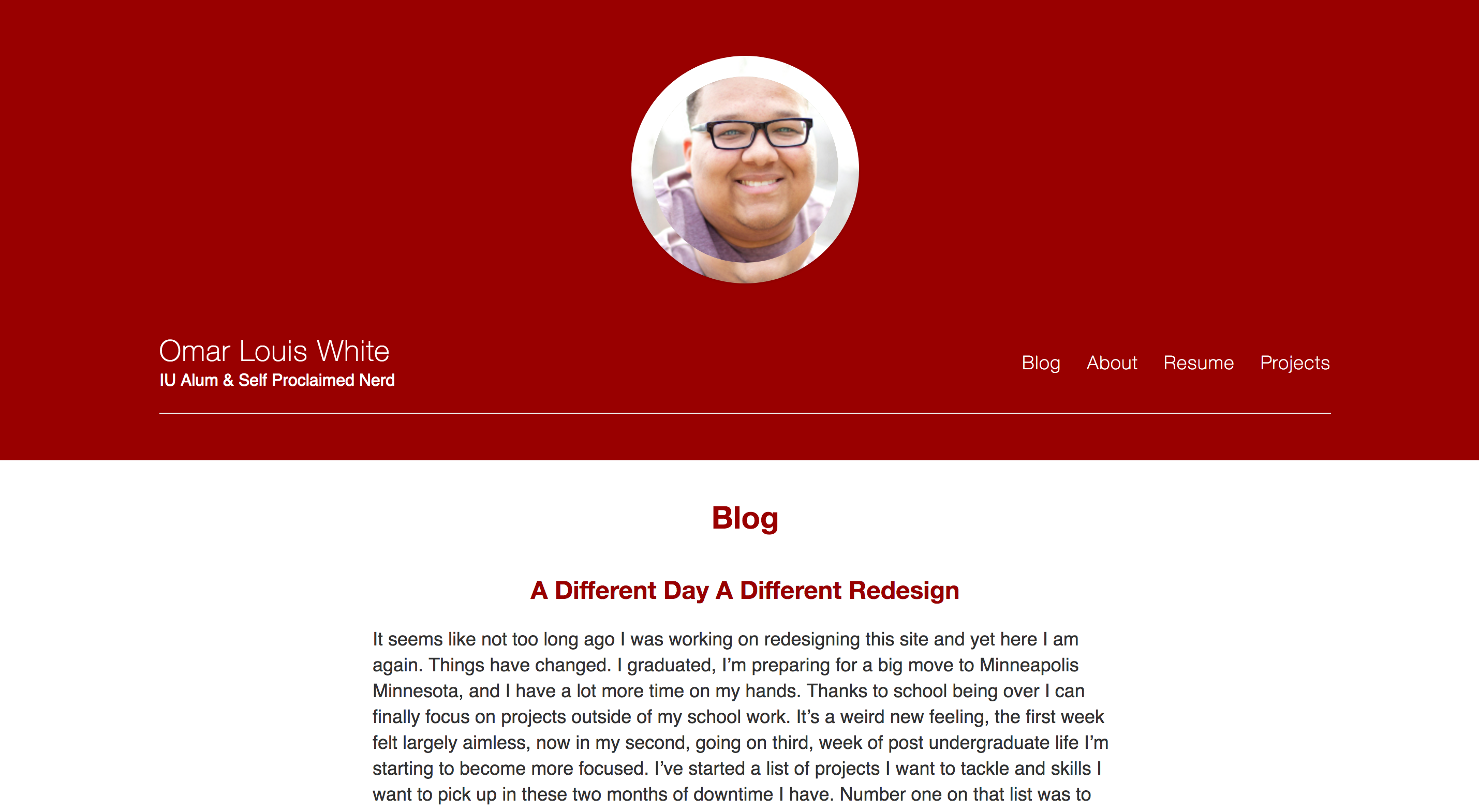 And here we have an image of what we’ve got now.
Like I said before I quickly became tired of the old layout, even though it has things I will miss, mainly it’s projects page layout. For the most part I’m happy with this design and now that this is out of the way I hope to get to work on a few other projects I’ve had in my backlog. Once I have more things done that are worth while expect me to write about them here.